


SERVIR-Amazonia´s plan for monitoring, evaluating and learning (MEL Plan) along its intended outputs and expected results is currently being used for periodical reviews of progress, aiding in detecting and acting on implementation challenges, and determining how to adjust our course in response to changing conditions. The plan itself has benefited from multiple adjustments along our rapid learning cycle in these first 18 months of Program implementation in the Amazon basin.
SERVIR-Amazonia indicators
Together with its Hub partners SIG, ACCA, IMAFLORA and the Alliance of Bioversity International and CIAT, SERVIR-Amazonia identified at Program start eight strategic indicators to monitor progress towards targets. The indicators cover implementation activities from the establishment of solid programmatic partnerships, through the networked co-designing of services all the way to expected benefits for communities – and the environment – emerging from the use of services by governmental agencies and organizations at national or local levels working in resource management and resilience in the Amazon basin and countries.
These eight indicators (IND) and their disaggregates cover the expected intermediate results (IR) of our strategic approaches (Figure 1).
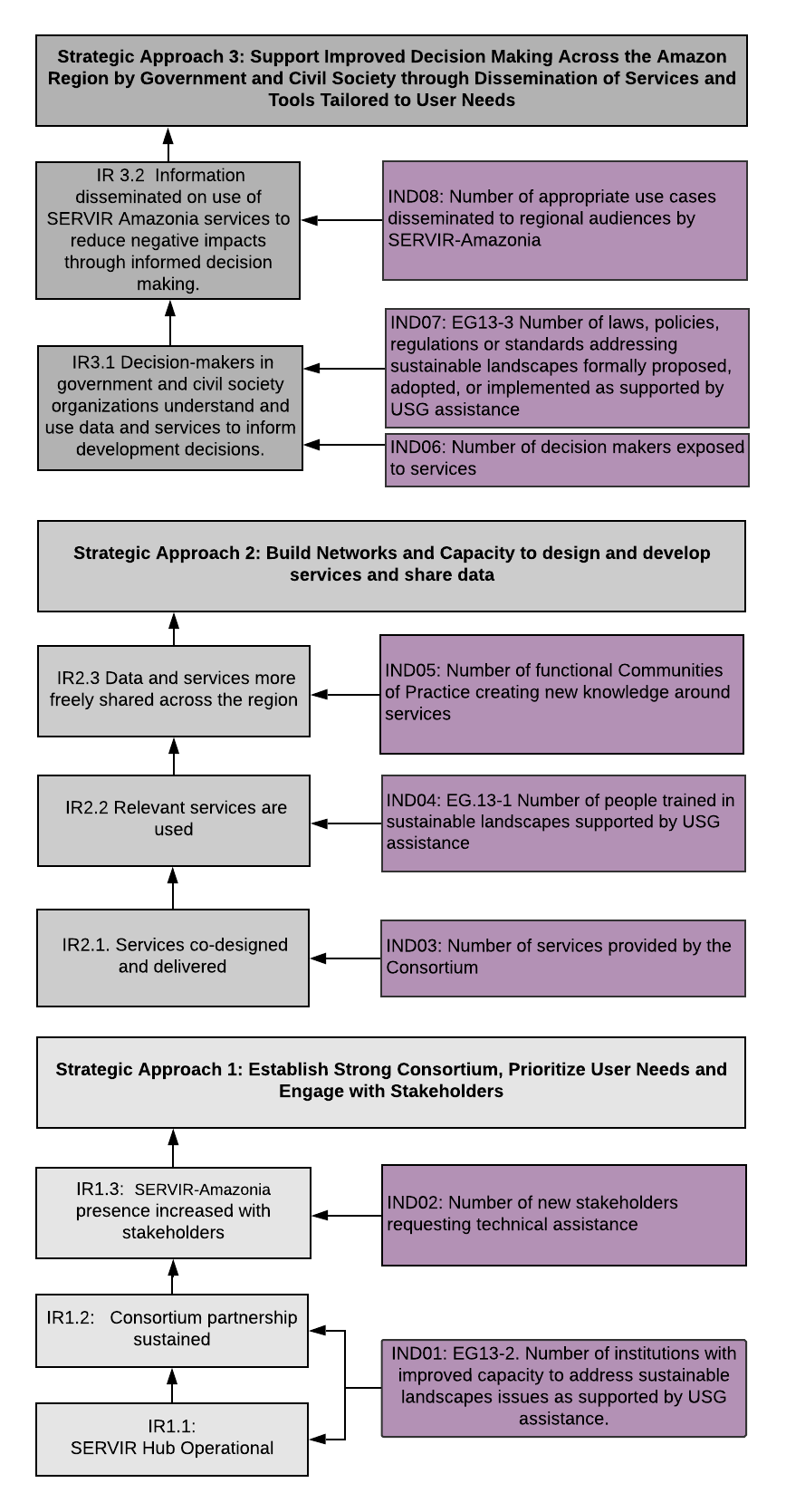 Figure 1: SERVIR-Amazonia indicators for intermediate results and strategic approaches
The dashboard
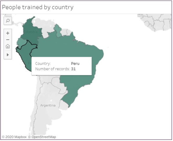
This online dashboard has the double aim of (1) providing public transparent communication on how the Program is doing and (2) motivating our own reporting and monitoring by allowing us to see these crucial diagnostic numbers at a glance. For now, we show results related to three of the eight SERVIR-Amazonia Program indicators, the ones which have “moving” numbers in these initial implementation quarters: People trained by the Program, Technical requests received from our partners and various organizations in the region, and Decision-makers exposed to the Program and its geospatial services concept. The dashboard screenshot below (Figure 2), shows disaggregates for indicator 02 (number of new stakeholders requesting technical assistance). The total of technical requests to date can be seen as a part of the program target total, 90.
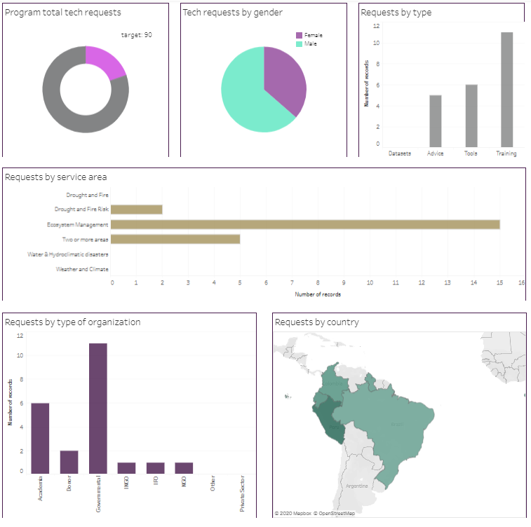
Figure 2: Screenshot of the MEL dashboard
Over the next months, more indicators will start having visualizable data attached to them. We are especially looking forward to being able to use this dashboard to repurpose, analyze and present data on IND03: Number of services provided by the consortium and its disaggregates (stage of development/ service area/ country).
The tool: Tableau
To compile the SERVIR-Amazonia indicators, we worked closely with the data management team of the Alliance of Bioversity International and CIAT, using our current indicator logs, in Microsoft Excel online sheets, to feed directly and in real – time into Tableau. We chose the Tableau data visualization tool because of the team’s previous experience with it, knowing that the tool is powerful yet easy to use. Responding to the Program´s data visualization needs and expectations, Tableau allows the creation of graphics that are easy to understand for any reader – those familiar with the Program and new – and to share and embed content on the Program’s Website.
It took some time to create a reliable and flexible datasource for Tableau for each indicator, and to address some key design issues:
- How should this dashboard look? We found Inspiration in external Tableau dashboard examples and other recommendations, like the ones featured in the BetterEvaluation website. The SERVIR-Amazonia color palette was used to add the Program “look and feel” to the final graphs and overall visualization.
- What type of chart is the best for showing each particular disaggregate? After intensive trial- and – error learning loops with the visualization options and the specific needs of each indicator and corresponding disaggregates, the result is reflected in the dashboard: a combination of bar graphs, pie charts and maps were chosen – roughly the same for each indicator, which also will allow for comparison between these 3 indicators.
- Should the indicators be featured on one single or separate dashboard pages? In the final product, there is a separate dashboard for each indicator, but they are grouped in one Web page for a better “visualize at a glance” effect.
Although the indicators and its dashboard are only one element of our Monitoring, Evaluation and Learning approach, they guide the implementing team in their periodical discussions about targets, their rationale and the analysis of the processes to achieve them. The dashboard will ultimately allow the Program to share monitoring data with our partners and stakeholders, increasing our transparency in the region, and the program and services´ exposure.
Authors of this blog post

Sophie Alvarez
MEL Consultant

Paola Cruz
Data Systems Analyst, Data & Research Methods unit, Alliance Bioversity-CIAT

Simone Staiger
MEL and Communications Coordinator, SERVIR-Amazonia